2 fplanque Sep 08, 2016 01:04


Thanks for the courtesy of your extensive reply, Francois.
Now I must reply back, for the same reason...
It will take some time to write all of this down, so it may take me a more than one post. Bare with me.
Let me also clarify that I'm not a coder, even if I learned how to copy/paste stuff in CSS, PHP or JS in the decade and a half I have been building sites.
I'm a designer, Dreamweaver is my only tool, and if I don't have to meddle with code so much the better - I'm always fascinated to see that I did something in code that actually works, even if I don't understand why it does...
If old fashioned and dirty works, it is the same to me; rather than clean and not works.
Part 1 - Let's start with the main issue: mobile.
You state that B2evo is mobile, but as far as I and Google are concerned, it is not.
My other sites get a 96 to 100/100 mobile experience but the Bootstrap Blog skin (even when set to mobile) gets only 71/100: the images don't scale to the view port, and the tap targets are too small. I had all of that fixed in v4.x
Should fix: Enable compression, eliminate render-blocking JavaScript and CSS in above-the-fold content, the page content is too wide for the viewport.
I can't find the gzip compression setting right now, but I'm pretty sure it's enabled. I will also be moving to a new server soon, and hope that at least this issue will be of less impact.
On v.4.x I injected the following code through _html_header.inc.php, which rendered everything - including images - to the viewport:
<meta http-equiv="X-UA-Compatible" content="IE=edge" />
<meta name="viewport" content="width=device-width, initial-scale=1.0" />
Dirty? Maybe. But at least it worked.
Now it does not; I copied the php file from the site folder to the skin folder and then applied the code, which did nothing else than eliminate the admin toolbar at the top of the page.
Am I doing something wrong? Sure. But hey!
One of the sites I moved off of B2evo is http://istrarbeauty.com mostly because about 80% of all visitors come from mobile, be that smart phones or tablets.
Scaling to the view port did not suffice here. I needed the off-canvas section to show menu items off-screen on mobile devices (the 3 top-left orange bars in the attached pic), something that bevo lacks, or at least lacks out of the box.
I'm sure it can be done, but I'm not a coder, remember?
As a result, the 4 sites I designed recently all get a close to 100/100 mobile score from Google, without any coding or frustrating "trying to figure it out".
I can understand, Francois, that this may not be the philosophy of B2evo. That you need me to spend time on the manuals, and figure out all the stuff that worked before, but not anymore.
But when time and money are scarce, I need to be able to quickly build good-looking websites, without having to recur to manuals or digging around in endless forum threads.
Yes. So far I have always been able to figure out things in the end, but also - virtually always - at the cost of a considerable amount of time. Time I don't have or are not willing to spend anymore, given the alternatives available to me.
Tomorrow: Part 2. Tiny MCE
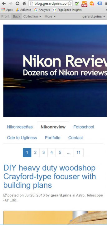
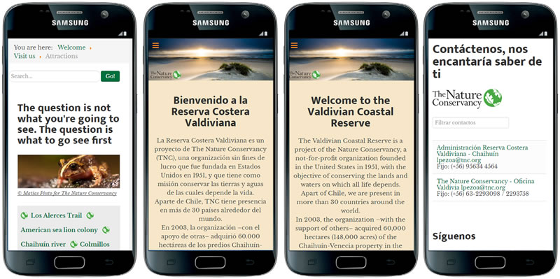

OK, now we're talking. Your reply here gives sufficient level of detail for us to help you and/or actually do something about shortcomings b2evolution may have. I may not be able to reply to everything at once, but I will get through all of your issues.
0) Quick note before I start: please make new forum threads for additional issues (such as TinyMCE). It will make things easier to read/follow.
So let's start with mobile issues here:
1) You quote 2 <meta> headers that you want to inject into your HTML headers (by using some old hack that was necessary in version 4 but is not necessary any more).
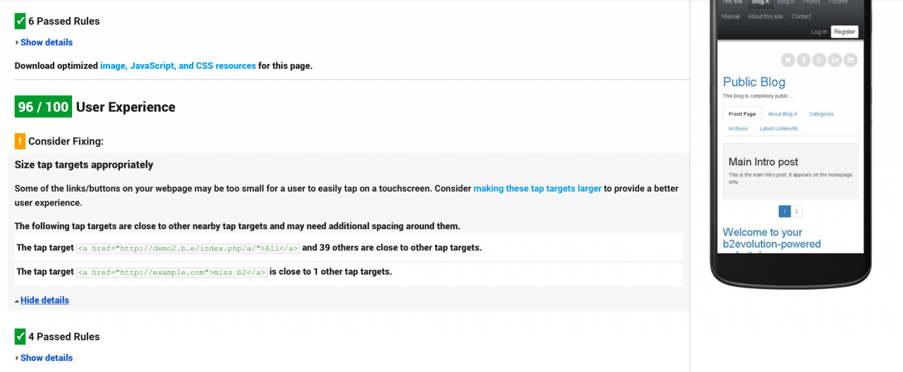
Please look at the screenshot attached below; it's from our demo site, which you can check yourself. Those 2 very same headers are ALREADY included in the header, Out Of The Box! The very thing you are saying doesn't work.
SO you are trying to fix something that is not broken by using an old hack for a 3 year old version and you are complaining that the old hack doesn't fix what is not broken.
2) Should you actually need to inject additional headers into your b2evolution pages, you would not need that old hack either. You can enter what you need directly into the backoffice here: http://b2evolution.net/man/skin-and-style
Again, you do NOT even need to do this for mobile support.
(But -- Hint -- you could use this to load Google WebFonts if needed... UPDATE: http://b2evolution.net/man/howto-add-a-google-font)
3) I will get through your other issues and I can understand you don't want to search the manual as you have not had a good experience with it so far, but can you please do me a favor? For each of these issues, can you please tell me what you would type into the manual's search field (first thing that comes to mind) if you were going to try to find an answer there?
This would be very useful for us to understand how to better index the Manual.

4) Let me get back on what you wrote before quickly:
let me write custom CSS, then recompile and minify CSS, JS and HTML automatically, allowing me to concentrate on designing and building great looking sites in a matter of days or even hours.
We rewrote this man page to clearly lay out the 3 options you have to write custom CSS in b2evolution:
http://b2evolution.net/man/howto-add-custom-css
Please have a look and please let me honestly know fo where b2evolution falls short in letting you write the custom CSS you need. (And I accept "I couldn't find that easily enough" as a shortcoming but in that case, please let me know where you looked for it and where you expected to find it, so we can address that too. Just don't say that the only problem is the UI is not organized in the same logic as Joomla...)
Thanks.

5) Now, the Google Page Speed benchmarks. You say:
You state that B2evo is mobile, but as far as I and Google are concerned, it is not.
My other sites get a 96 to 100/100 mobile experience but the Bootstrap Blog skin (even when set to mobile) gets only 71/100: the images don't scale to the view port, and the tap targets are too small. I had all of that fixed in v4.x
Here's EXACTLY what the Bootstrap Blog skin of b2evolution OUT OF THE BOX (as you like to put it yourself): https://developers.google.com/speed/pagespeed/insights/?url=http%3A%2F%2Fdemo2.b2evolution.net%2Fstable%2Findex.php%2Fa%2F
What I see is 96/100 User Experience.
I'm not saying it can't be improved (we will). But if you're saying that b2evolution gets only 71/100, I can only say WTF!?
Are you ready to consider that:
If so, please tell us:

Francois
Just following and am slightly in awe of your patience.
@ amoun: ditto
Thanks francois.
I will answer all your questions shortly.
OK. First things first.
Following the instructions, article images now scale to the view port. Good.
Of course I will now have to reconfigure all images in some 300 posts... Not exactly a seamless upgrade, but I assume we all have to pay the price.
I also need to style them (link, border/no border, roll-over, etc.). No docs on that, as far as I can figure (search: image styling).
If I understand the general idea correctly, you'd probably want me to do this through CSS, but there is no styling related menu item at the "Images & Attachments" section of the posts...
Still, we're advancing.
And one last comment for today.
Many new features of B2evo may work just as expected out of the box for new installs.
But for upgraders, it may be a mayor pain in the behind to find that many things do not work anymore as they used to. <img> Is just one example, but hacks, dirty code and deprecations are other elements to take into consideration.
In fact, when I apply the Bootstrap main skin, it does not work; the header image does not show. If it did, it would be a good starting point to made mods...
Moreover, that skin does not consider a sidebar, which I need for various reasons.
The update / upgrade page does not mention possible limitations -- among those indicated -- when upgrading; I think it should.
My frustration comes from having been on this system for too darn long (at least since 08/08), not being aware that the design philosophy, protocols and work flow have changed over time and not being alerted / advised on the particular.
If the upgrade page -- which I understood said I could upgrade from any post v.2 install without mayor problems -- were to warn me that some or many old(er) protocols may not work as expected anymore, I would most certainly not have taken it that lightly, and would, most likely, not have been as frustrated.
In fact, I might not have upgraded, and we'd all have saved ourselves some time, to say the least...
;)
PS: I opened a new thread on Tiny MCE, as suggested.
http://forums.b2evolution.net/tiny-mce-what-the-heck

6) Oversized legacy images:
Following the instructions, article images now scale to the view port. Good.
Of course I will now have to reconfigure all images in some 300 posts... Not exactly a seamless upgrade, but I assume we all have to pay the price.
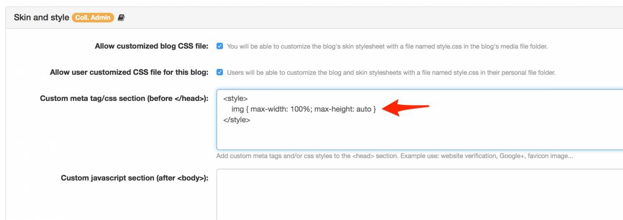
Please try to add
<style>
    img { max-width: 100%; max-height: auto }
</style>
in http://b2evolution.net/man/skin-and-style and please let me know if it fixes your 300 legacy posts.
Also please let me know if this creates any side effects?

7) Styling images:
I also need to style them (link, border/no border, roll-over, etc.). No docs on that, as far as I can figure (search: image styling).
If I understand the general idea correctly, you'd probably want me to do this through CSS, but there is no styling related menu item at the "Images & Attachments" section of the posts...
Still, we're advancing.
There is no styling menu indeed in the Attachments panel. The plan is to add a dialog when you click the (+) icon.
However, don't let this stop you! I added the missing info to: http://b2evolution.net/man/image-short-tag
Can you work with this until we have an UI for that? (note that it also allows infinite styling by created classes that can be just as complex as you want them to be)
About adding links: can you give an example ? Depending on what you want to do one solution's better than the other.

8) About resistance to change... (yes I know, that one is a bit sarcastic, sorry)
But for upgraders, it may be a mayor pain in the behind to find that many things do not work anymore as they used to. <img> Is just one example, but hacks, dirty code and deprecations are other elements to take into consideration.
The update / upgrade page does not mention possible limitations -- among those indicated -- when upgrading; I think it should.
My frustration comes from having been on this system for too darn long (at least since 08/08), not being aware that the design philosophy, protocols and work flow have changed over time and not being alerted / advised on the particular.
If the upgrade page -- which I understood said I could upgrade from any post v.2 install without mayor problems -- were to warn me that some or many old(er) protocols may not work as expected anymore, I would most certainly not have taken it that lightly, and would, most likely, not have been as frustrated.
In fact, I might not have upgraded, and we'd all have saved ourselves some time, to say the least...
;)
First please do yoursefl a favor and spend 10 minutes clicking around on the demo server : http://demo.b2evolution.net - you will quickly get a feel for what has changed since v4.
Second, this section: http://b2evolution.net/downloads/ lists all the changes since your v4 but I'm willing to bet you did NOT read the long lists of changes. And I don't blame you for not reading them. But I do blame you for wanting a digest of changes that ould be tailored uniquely to what is of interest to you personally and believing that the 10 changes that matter to you are more important than the 500 others. Everyone has their own 10 important features...
I do reckon though that the amount of changes can be daunting, especially if you wait 3 years in between upgrades.

9) Main skin : if you don't like that skin, use another! That's why we have: http://skins.b2evolution.net
Also, you did not show where and how you added your header image, so I still can't help you with that.
Also, the menu does not look very good. It would be nice to have it off-canvas on mobile devices (see example below).
You might find a skin that does off-canvas on http://skins.b2evolution.net
More responsive menu options are coming in b2evo 7.0
10) Flush. Can you be more specific? Are you trying to insert a PHP flush() command somewhere in the code?
6) I'm switching servers, right now. I will answer implementation qs asap.
7) That should work, for now.
[image:15]As far as links on images are concerned, I tried this: <a title="Moon large" href="html/moon.html" target="_blank"></a>, but they're being taken over by a light-box akin pop-up, that shows the image at the same size as inserted in the article. I imagine the latter can be modified to scale images larger or to turn the pop-up off, but I have not found that setting yet. Moreover, I would be nice to be able to scale the inserted images to something else than 100%, which I have not been able to figure out either.
Since I never figured out how to do pop-ups (or roll-overs) properly in the previous version, I often link to external html files to show large images and/or stuff that does not fit to the blog page:
http://blog.gerardprins.com/html/Nikon-DSLR-Motor-NAI-AI-AIS-AIP-AFD-AFI-AFS-GPS_Compatibility-chart.html
http://blog.gerardprins.com/html/domino-test.html
or to do roll-overs:
http://blog.gerardprins.com/html/Minimum-aperture-signal-post-animated.html
http://blog.gerardprins.com/media/focus_es.html
8) Everybody resists change, right? And we don't read ;)
Except this:
http://b2evolution.net/man/quick-upgrade-procedure
and this:
http://b2evolution.net/man/upgrade-instructions
and this:
http://b2evolution.net/man/installation-upgrade/upgrading/instructions-for-specific-versions/
and this (among others)
http://b2evolution.net/man/upgrade-to-version-6
The are however, no pages referring to upgrading from v.4 or v.5. Since upgrading from 3 to 4 did not present any problems (except for some expected changes to the skin, with which Foppe helped out) I - incorrectly - assumed that the upgrade would not present mayor problems, especially because I followed the upgrade instructions to the letter and never have really "hacked" core files, CSS or PHP.
Wrong.
9) I'm using this skin, since it's supposed to be bootstrap. Also tried Horizon_main (lacks sidebars) and Bootstrap_main, which did not seem to work (for whatever reason).
I was very aware that upgrading would likely force me to change skins and that I would have to put some serious work into that. So, I'm already pleased to see that my widget positions did survive, at least.
Question is, what skin would you suggest, considering that I want only a "few" things: flush image header, different type face, as mobile as possible and (wink-wink) the loss that really hurt: view counts?
Heck; If I can't get tmce to work I could even build articles in Dreamweaver and then simply copy/paste the HTML...
THX!

Re 7) about linking images:
Instead of
<a title="Moon large" href="html/moon.html" target="_blank">[image:15]</a>
use:
<a title="Moon large" href="html/moon.html" target="_blank">[inline:15]</a>
And make sure to add the custom CSS proposed in 6) (comment #14)

8) Errr... http://b2evolution.net/man/upgrade-to-version-6 applies to ANY upgrade TO v6, no matter what your previous version was. It applies to you.

9) Why don't you use Bootstrap Blog for your homepage if you want a sidebar. Look at Blog B on the demo server to see how Boootrstrap could be used to display a homepage.
Otherwise please draw/sketch what you need for your homepage and we'll see if we can make it happen. (Or make a mockup with dreamweaver)
Note: you keep not answering about how your header image is currently handled and what flush exactly means.
You ask a lot of questions, so, some may take some time to answer.
The code suggested in #19 is cool. It shows the image at full size inline on the page.- Not exactly what I was aiming for (an external link).
Nice try tho' (see attached)
Flush (as defined elsewhere, used for years in the Simple Zen skin, and as I understand it) means across screen - see attached -, and it is implemented in the header of my skins as an "image" widget (which is "boxed" and does not offer a "flush" option).
I insist that I'm not a coder and probably misunderstand or are incapable to apply stuff you'd want me to. That's where other systems are more of a help. They don't expect me to write code, css, or understand the underlying logic.
My guess would be that - as with photography - amateurs rule. I'm not sure this is fully understood by the dev team.
Please count on me for anything that might be of help.
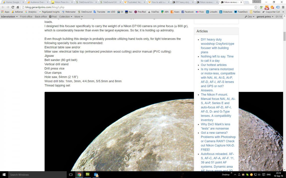
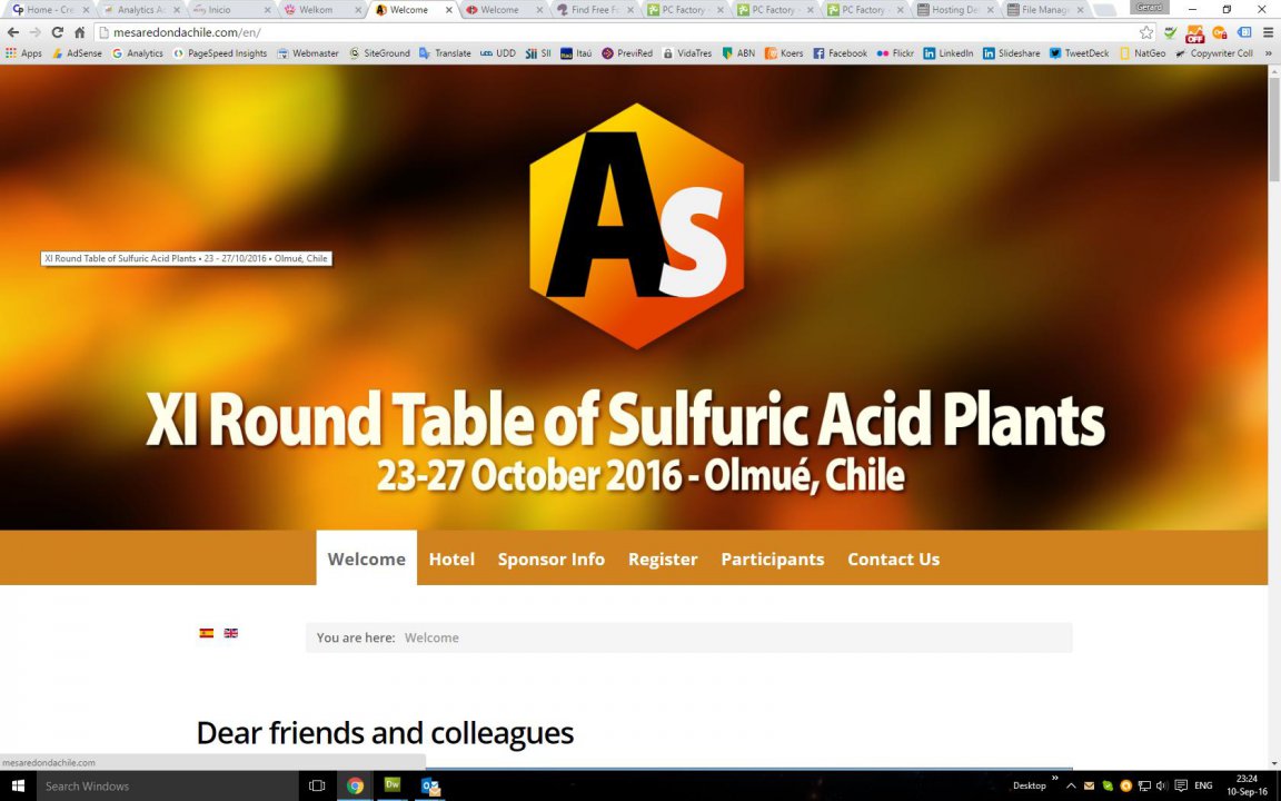

You did not read #19 completely! the last line is paramount!

about flush: I do understand that amateurs rule. What I did not understand was what you meant by "flush" until you cared to explain it above. I don't think it's reasonable for you to count on "defined elsewhere" in a case like this (try typing "flush" into google for a second opinion about why it was not obvious ;)
Also about not being a coder: note that I did not ask you to go edit a single file of code since the beginning of all this. I even insisted on not using your old hacks from v4 and that everything should be done without touching the code. We really don't expect you to be a coder.
So basically, are you saying the Bootstrap Blog skin would be what you need if it allowed to put a full-width background image under the header?
If so, would you agree that the title of your blog would be better served as text rather than burnt into the image?
"Flush" is a standard CSS term, not specific to any platform and in use since 2006, or so.
A full width image is requisite, IMHO, "burnt-in" text does not impact page load and the text can be available in "alt" (as demonstrated) and thus does not necessarily negatively impact SEO
Even though a text header is preferable, positioning and styling it can be a challenge - even though I managed to do this without mayor problems in the Simple Zen skin on v.4.
Now, it is a challenge.
As is the fact that half of this text shows as <h2>
Clueless

Comment #19 says that the thing explained in #19 will not work if you don't do #14 first.
Do you understand what is explained in comment #14?
(PS: h2s are generated by markdown rendering. Any line that starts with # will be considered a heading)
(PS2: seriously no, there is no concept of 'flush' in the CSS specifications.)
The thingy proposed in #14 is not yet implemented due to the server switch :D

Would the Bootstrap Blog skin be what you need if it allowed to put a full-width background image under/in place of the header?
Yes, the code is understood, even by an imbecile like me and - again - my needs are very modest.
Questions #25, which - BTW - were answered in #26, but hey, maybe we're not understanding each other, asking the wrong questions or giving the wrong answers.
Design considerations aside, Bootstrap_blog isn't pretty, but it works
Love dialogue (or the interchange of opinions), and we're sure are having one here ;)

So you asked about a skin recommendation. In order to get a "flushed header image" and also a menu that behaves nicely on mobile, I recommend you try out the Ark skin: http://skins.b2evolution.net/ark-blog-skin
PS: and I really recommend you upgrade to the latest version to get your bugs fixed first. Don't tell me it doesn't work if you haven't upgraded.
I have not been telling you anything, lately
;)
Rereading this thread.
A quick remark on #4: if out of the box mobile really worked, why would I want to implement a "3-year old hack" to fix something that is already working?
The hack was tried because something was NOT working!
It would really help if you described what actually doesn't work for you (screenshots appreciated).
What does that even mean!? We say it is!
Go to http://demo.b2evolution.net and please make a screenshot of what you think is not "mobile"
Like what?
FontAwesome has absolutely nothing to do with Helvetica; FontAwesome provides icons and nothing else. http://fontawesome.io
If you want UI settings for changing fonts because modifying a CSS file by hand is annoying, why don't you just ask for it? That is actually something we can add.
Care to give a specific example of how you got lost?
Care to post a picture of what you consider "today"?
Can you afford type to describe your issues with annotated screenshots? It's the best way for us to know what your problems actually are. Otherwise they will not magically fix themselves. Don't think your problems are obvious or even the same as what others want. If you don't explain, we don't know and we spend our time fixing someone else's problems...
b2evo is also "100% mobile" (whatever that is supposed to mean) out of the box. I use it on my phone all the time.
Do what? Change the font. As said, how about asking for the feature instead of complaining we didn't read your mind earlier?
We are working on these things in b2evo v7.
In one sentence you say you don't want to write code and change a font in CSS and now you're talking about recompiling CSS. You realize you're just throwing complaints in the air but you are not specific about any of this? So it makes it very hard to help you.
What skin or what URL are you talking about?
Again, can you explain what your problem is on mobile?
How about you really explain what you would like to do (with screenshots) so we can actually understand what you mean.
If TinyMCE is broken, we will fix it.
When you want to put a border on an image, what do you actually want to do? Apply a CSS class to it or add a dirty old
border="1"to the HTML code?Are you using b2evolution's attached images feature at all?
Link please.
You know we actually upgraded an old version of TinyMCE to a newer version of TinyMCE as found here: http://tinymce.moxiecode.com
TinyMCE actually removed a lot of old school HTML properties, for example for harcoding styles on images.
There is a reason they did that. It's not a good practice to do that. And it is NOT responsive , i-e: NOT mobile friendly.
That being said, I'm not saying it was a good decision to upgrade TinyMCE without caring about some extra functionality. Based on other (more specific) feedback we are going to give TinyMCE more love in future versions (work already underway).
To do what?
What are you missing in the toolbars?
b2evolution has a file manager. If you expect an additional filebrowser inside the editor, you probably completely missed the way b2evolution handles images. Please look at this: http://b2evolution.net/man/adding-photos-or-images
Do you realize that you want to edit borders and margins in the editor (so probably directly on the
imgtags) and at the same time issuing complaints about mobile compatibility. Do you realize that harcoding margins into content is the first thing not to do for displaying the same content on desktop and mobile?Can you describe how to reproduce this?
If "forward" means hardcoding old HTML IMG properties into the content, then we definitely disagree on what a Content Management System should be.
What I understand here is that you don't want to unlearn the way you added borders and margins in HTML 10 years ago. It is very very "backward" to want to do that in 2016. Maybe we lacked in explained this, but still... I will agree there are a lot of things we could improve; but this is not a "forward" goal.
So you're really serious about mixing content and presentation using old school HTML attributes (and having TinyMCE help you insert those old attributes)? That's the crux of your problem?