

 General Support
2 gerardp Sep 28, 2016 18:58

 b2evolution CMS Support Forums
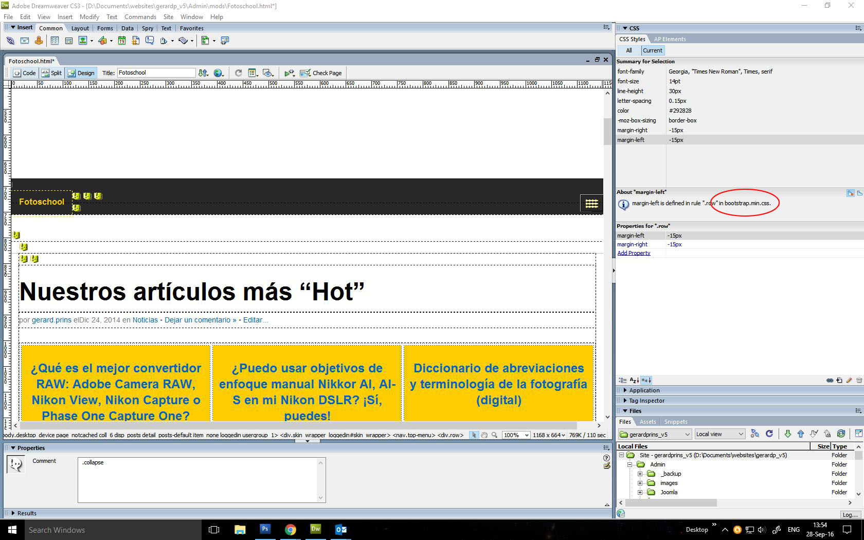

Hello @gerardp
I would like to help you with your issues with the Ark Skin.
However, the header image does not scale to the view port.
I am afraid I cannot produce the bad image scaling in the header section. I can see that you are using Dreamweaver for modifying the skin, so what I would like to know is: are you trying to add the background image in the header section from the back-office of the skin or inserting directly in the skin files PHP?
Is there a setting or css where I can change this?
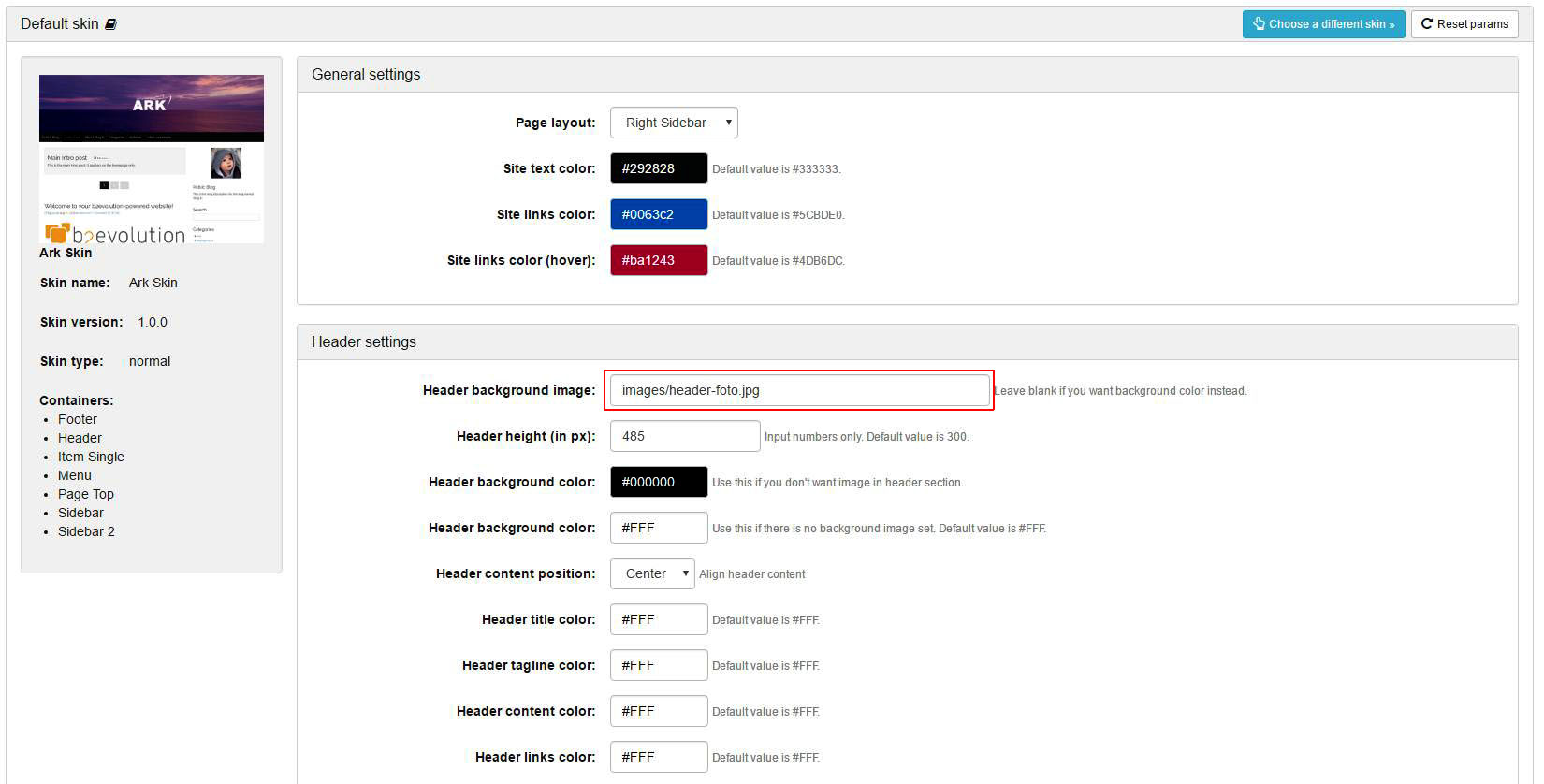
There is an option in the back-office of the skin where you can change the path of the image you want to position as the header image. Starting position for the path is the skin's root. For example, you can place an image in the folder "images" that exists in this skin's files and add path to that image like this: images/specific_image_you_desire.jpg.
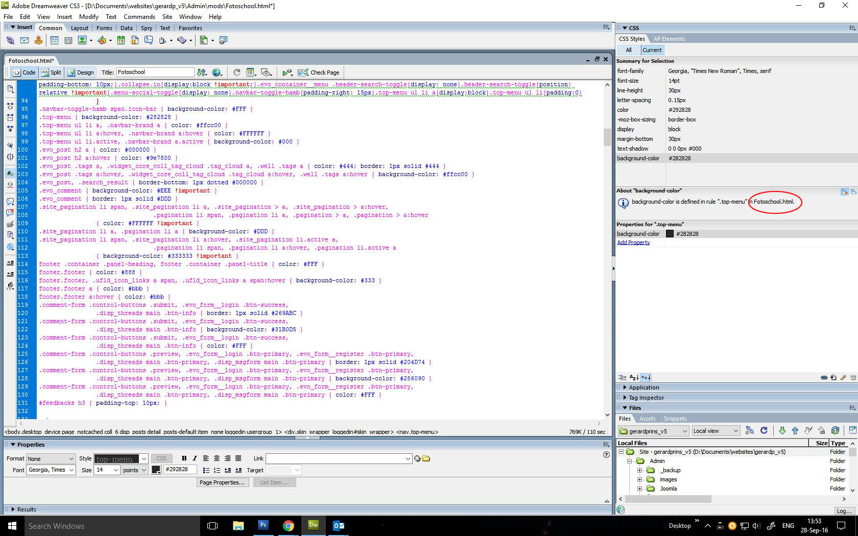
Moreover, style.css appears not to be the only one that rules this template.
Each b2evolution skin contains several CSS sources for it's layout and they are all important. You can check this by opening Page Source in your browser (right click on your page -> "View page source" on Chrome). There you can find 12 CSS files that the Ark skin uses. But, you should always concentrate on only one of them: style.css.
It seems that certain elements must be modified in bootstrap.min.css...
You shouldn't modify this, or any other file except the style.css, because these styles apply to all bootstrap-based skins.
while the page also appears with css embedded in html (apparently from style.css?).
Each color setting from the back-office of the skin requires embedding in HTML. You should try to use these skin settings instead of trying to overrule them with another CSS.
b2evolution skins are designed in the way that any CSS rule can be overruled with direct input in style.css. So, this is the main file you should focus on if you want to make specific CSS changes.
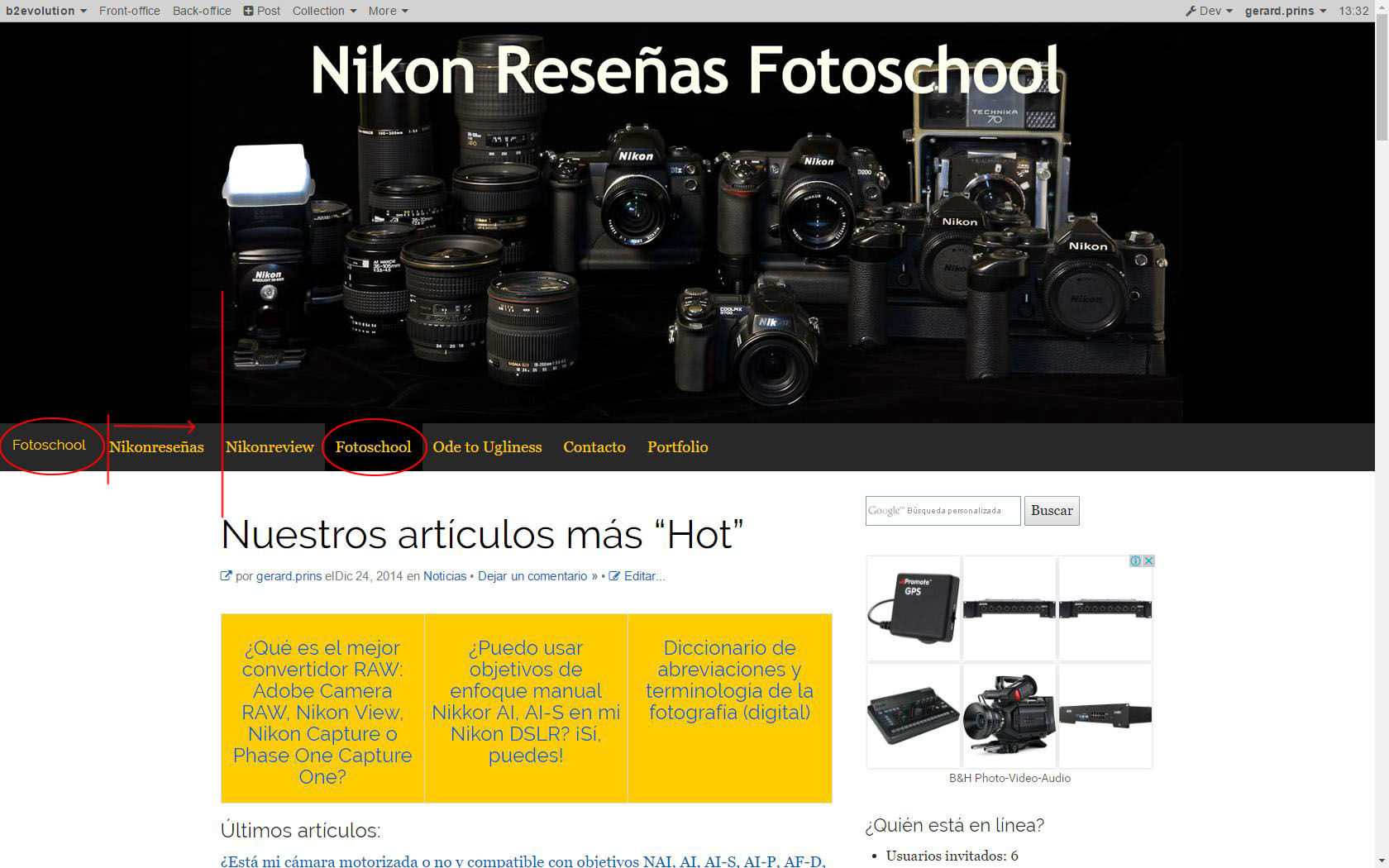
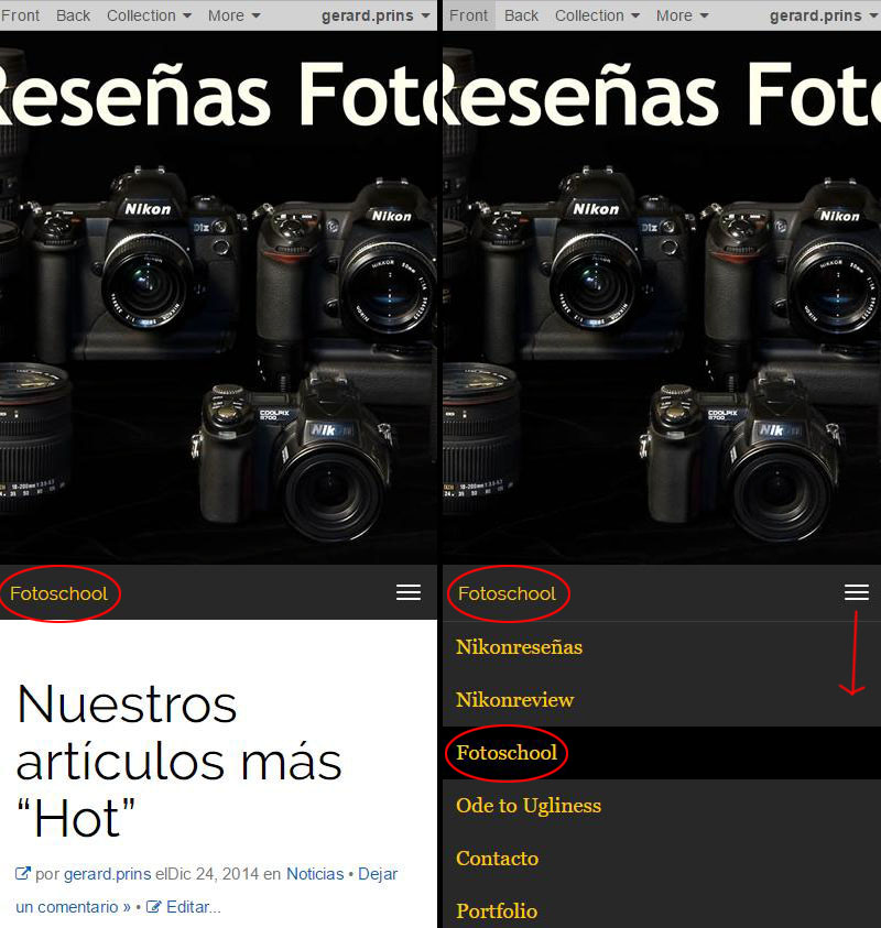
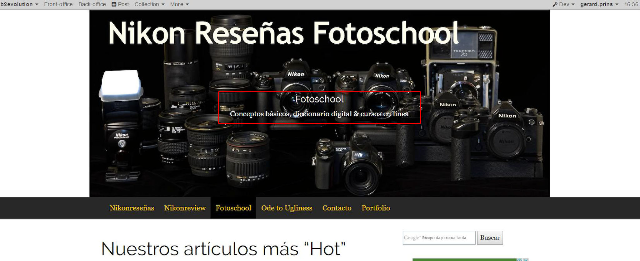
Also, the link to the Fotoschool blog is repeated in the menu...
The first link in the menu is linking directly to the chosen Front page of your collection, which you can modify following this tutorial: http://b2evolution.net/man/collection-front-page-settings.
The title of this menu link is by default the name of your collection, in your case: "Fotoschool". You can modify collection name following this documentation: http://b2evolution.net/man/back-office-reference/collections/collection-settings/general-collection-settings/.
You are experiencing issue with "the repeating menu link" because you manually added another menu link that is leading to your Front page. If you disable the fourth menu link called "Fotoschool" from the back-office of the skin, you will still have the Front page as the first link in your menu.
If, however, you desire to position the front page exactly as it is in your screenshot (being the fourth menu link), you can do that by removing the first menu link manually, by removing the following code from _body_header.inc.php (lines 48-59):
<?php
// ------------------------- "Menu" Collection title --------------------------
skin_widget( array(
// CODE for the widget:
'widget' => 'coll_title',
// Optional display params
'block_start' => '<div class="navbar-brand">',
'block_end' => '</div>',
'item_class' => 'navbar-brand',
) );
// ------------------------- "Menu" Collection logo --------------------------
?>
Or, you can wait for skin update/patch, where the first "Front page" link in the menu list will be optional.
...while I would also like to align the main menu with the main content block (see attached).
To do this you would have to modify _body_header.inc.php again in the following way:
You have to change this:
<!-- Collect the nav links, forms, and other content for toggling -->
<div class="collapse navbar-collapse" id="navbar-collapse-1">
<ul class="navbar-nav evo_container evo_container__menu" id="menu">
<?php
// ------------------------- "Menu" CONTAINER EMBEDDED HERE --------------------------
// Display container and contents:
// Note: this container is designed to be a single <ul> list
skincontainer( NT('Menu'), array(
// The following params will be used as defaults for widgets included in this container:
'block_start' => '',
'block_end' => '',
'block_display_title' => false,
'list_start' => '',
'list_end' => '',
'item_start' => '<li class="evo_widget $wi_class$">',
'item_end' => '</li>',
'item_selected_start' => '<li class="active evo_widget $wi_class$">',
'item_selected_end' => '</li>',
'item_title_before' => '',
'item_title_after' => '',
) );
// ----------------------------- END OF "Menu" CONTAINER -----------------------------
?>
</ul>
</div><!-- .collapse -->
into this:
<div class="container">
<!-- Collect the nav links, forms, and other content for toggling -->
<div class="collapse navbar-collapse" id="navbar-collapse-1">
<ul class="navbar-nav evo_container evo_container__menu" id="menu">
<?php
// ------------------------- "Menu" CONTAINER EMBEDDED HERE --------------------------
// Display container and contents:
// Note: this container is designed to be a single <ul> list
skincontainer( NT('Menu'), array(
// The following params will be used as defaults for widgets included in this container:
'block_start' => '',
'block_end' => '',
'block_display_title' => false,
'list_start' => '',
'list_end' => '',
'item_start' => '<li class="evo_widget $wi_class$">',
'item_end' => '</li>',
'item_selected_start' => '<li class="active evo_widget $wi_class$">',
'item_selected_end' => '</li>',
'item_title_before' => '',
'item_title_after' => '',
) );
// ----------------------------- END OF "Menu" CONTAINER -----------------------------
?>
</ul>
</div><!-- .collapse -->
</div><!-- .container -->
I really hope I helped you. let me know if there is anything else you are having trouble with.
Thank you for using the Ark skin.
@miloszivojinovic wrote earlier:
I am afraid I cannot produce the bad image scaling in the header section.
I tried to identify this issue again. I believe this will solve your problem:
body .headpicture {
background-size: cover;
}
You can add this at the end of your style.css. Please let me know if this helps.
Thank you for your quick (and long) reply @miloszivojinovic
FYI: I am not using Dreamweaver for inserting any new code -- be that php or css -- only for modifying existing stuff.
The header image is located in the ark_skin/images folder and was added through the back-end, not with custom code.
The fact that the fotoschool link is repeated, is -- I suppose -- due to the fact that the "Public collections list" widget displays all public blogs, with the difference that in Bootstrap_blog, for example, the front page link is not displayed separately as well
Your suggested php modifications worked like a charm, however, unfortunately the modification in style.css does not appear to work (at least not in Chrome and Firefox).
It would be nice if we can figure this out, because at least one other user is having the same problem.
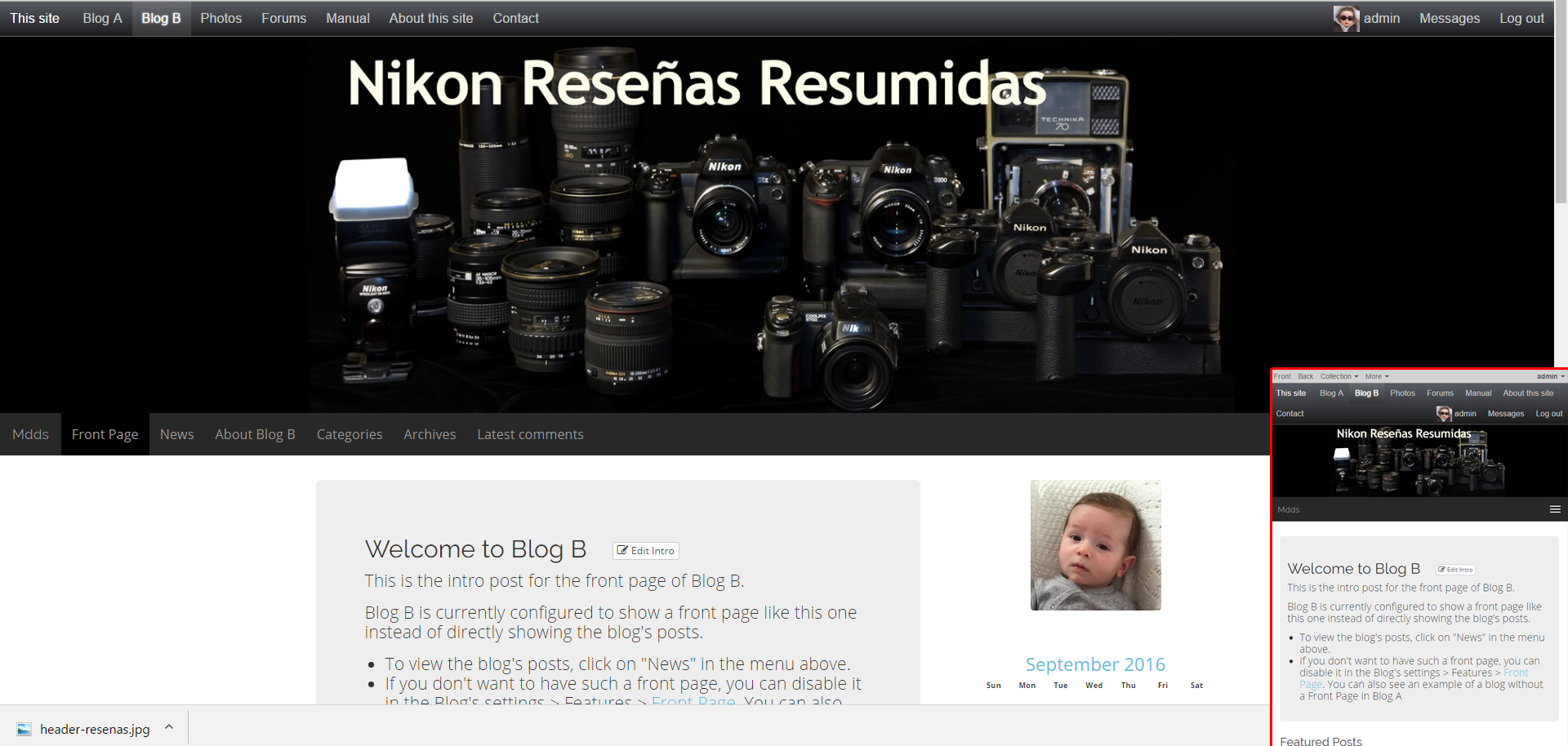
This is after the suggested mods were applied:
The same applies to Bootstap_blog, btw.
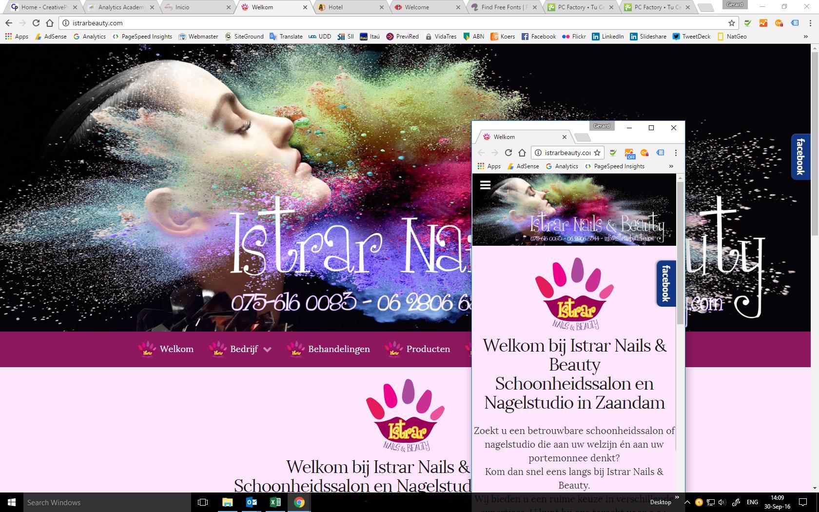
The header image inserted through the (image) widget from the back-end never scales to the view port...
See attached.

Hi again @gerardp .
I think I am now completely aware of the issue with the header image.
First, we are talking about two different things.
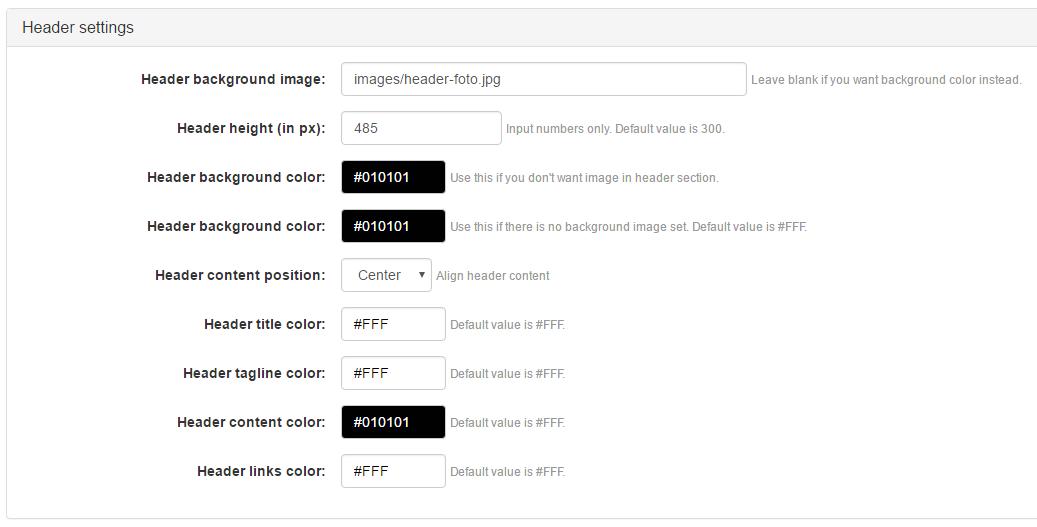
What I was suggesting was using back-office skin customization options (that can be found in the screenshot I uploaded below), but judging on your last screenshot, you were trying to add an image widget to the header container. Those two are not the same.
In the screenshot I attached, I highlighted the input field you should use for header image.
The header image inserted through the (image) widget from the back-end never scales to the view port...
Image widget requires from you to insert image size in height x width px format. Once this is done, you are giving fixed dimensions to the image, making it impossible to scale to viewport by itself.
I pulled this additional info that you might find helpful (from http://www.w3schools.com/css/css_rwd_viewport.asp):
- Do NOT use large fixed width elements - For example, if an image is displayed at a width wider than the viewport it can cause the viewport to scroll horizontally. Remember to adjust this content to fit within the width of the viewport.
- Do NOT let the content rely on a particular viewport width to render well - Since screen dimensions and width in CSS pixels vary widely between devices, content should not rely on a particular viewport width to render well.
- Use CSS media queries to apply different styling for small and large screens - Setting large absolute CSS widths for page elements, will cause the element to be too wide for the viewport on a smaller device. Instead, consider using relative width values, such as width: 100%. Also, be careful of using large absolute positioning values. It may cause the element to fall outside the viewport on small devices.

I think my last post created some confusion; I was just remarking having observed a similar problem in Bootlog_blog.
My implementation of the header image in Ark is exactly as you indicated -- as a matter of fact, it has exactly the same width as the original skin header image (2000 px).
For clarity, I attach a screen cap, while also commenting that the original out-of-the-box Ark skin (as is -- without ANY modifications) does not scale to the view port either.
Thanks again for your help.
Hello again @gerardp .
I am not really sure what are your trying to achieve with header image.
If you set fixed height on 485px (like you did), you are displaying the image in it's full height, leaving the width to fill the viewport automatically. I visited your blog and as I can see, that is exactly what is happening.
If you set fixed height, you cannot expect from the image to scale with viewport because it will become distorted (basically, because you are trying to fit the entire image of 2000px to smaller screen width while it's height is not allowed to change accordingly).
Ark Skin gives the header image centered position (both horizontally and vertically), but it also protects the image from distorting while having fixed height and variable width.
If your intention is to have header image that scales with viewport, you should first disable fixed height rule. That way, you will have your entire image fit any viewport size, but then you cannot control height. Height will be determined automatically depending on the current image width, preventing image distortion, which is very logical, right?
Now, the easiest way to do this is to make changes in _body_header.inc.php:
Change this:
<div class="headpicture">
<div class="headipic_section <?php
if($Skin->get_setting('header_content_pos')=='center_pos'){echo 'center';}
else if($Skin->get_setting('header_content_pos')=='left_pos'){echo 'left';}
else{echo 'right';}
?>">
<div class="container">
<?php
skincontainer( NT('Header'), array(
) );
?>
</div>
</div>
</div>
Into this:
<?php
// Display a picture from skin setting as background image
global $Blog, $skins_url;
$bg_image = $Skin->get_setting( 'front_bg_image' );
echo '<div id="bg_picture">';
echo '<img src="'.$skins_url.'ark_skin/'.$bg_image.'" class="img-responsive" />';
echo '</div>';
?>
Please be advised: doing this, you are removing header widgets container completely and replacing it with the hardcoded image that is in your images/ folder in Ark_skin.
I do not recommend doing this, but it will give you scalable header image you want.
What I do recommend is using images that are adaptive to the described header skin settings - images that do not have written-in text, plus using b2evo widgets in header container to achieve the same effect.
Hello and thanks again @miloszivojinovic
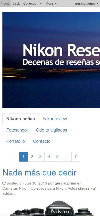
Let's start with what I am trying to achieve so we can take it from there on (see attached).
I am not saying B2evo should be Joomla, nor that what I am trying to achieve is necessarily universally understood as "responsive design"
In Joomla + Gantry 5, my pages plus header images automatically scale to the view port, using twitter bootstrap and set break points, something that I "sort of" achieved in B2evo 4.x by inserting the infamous
 <meta http-equiv="X-UA-Compatible" content="IE=edge" />

    <meta name="viewport" content="width=device-width, initial-scale=1.0" />
in the, now disappeared, _html_header.inc.php
Evidently, I would want to avoid "hardcoding" anything if possible; there's always the risk that it's over written at some point and often I don't remember anymore what I did and where I did it :D
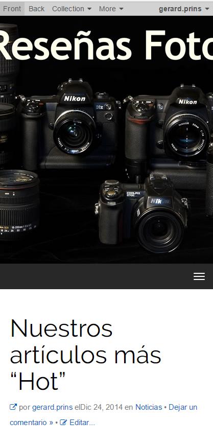
The reason I set the height of the header image is because the unmodified Ark skin sets its original image (images/bg-image.jpg) to 300 px., so I understood that it had to be set.
As such, the original Ark image header is not responsive either (it crops, rather than scales) which is, as you said, logical...
However, if no height is set, the image just disappears.
I truly hope I have made myself clear now
Thank you again for your work and patience.
There must be something else I am doing wrong as well.
Although I have set the header background and content to #010101, when the images is not full-width, the background is still white.
See attached.


Ok, about the header image, here's my understanding:
img tag@miloszivojinovic Does that make sense? Can you make it happen?
Thanks.
Thank you Francois!
One thing (if possible): "DOES care about alt-tag"
Cheers!
PS:
The reason I cropped off the extra black on the image above and tried to set the background color is that in my SIMPLE ZEN skin, scaling of the image would happen only after scaling the view port to the width of the image first; i.e.: after cropping off the extra background black (white, here) to its left and right.
If I add the extra black on the image, evidently, it will start scaling immediately as demonstrated in the image posted by @miloszivojinovic above.
Thanks!
Thank you both @fplanque and @miloszivojinovic for your understanding and hard work!
Looking forward to the update.
Sorry to be a pain, but while you're at it and if it's not too much to ask, maybe you could make the the collection title and tagline typeface a bit (or a lot) larger?
THX!
@gerardp The trend is to add font face and font face params to all skins but in your particular case, because you want an image with auto size, you will have to keep your title burnt into the image and you will not have an overlay title.
I was under the impression you were totally fine with the title burnt into to image file.
Yes alt text will be possible.
Yay!