

 General Support
2 mgsolipa Jan 05, 2016 15:29

 b2evolution CMS Support Forums
hey thanks for the reply..
I've used that method for both external as well as previously posted images and its OK for that use.
I'm more interested in including image thumbnails while writing a new post and uploading all new images for said post..
Currently I see no way to auto-magically add a thumbnail version of image / attachment aside from either pre-editing images (old school, been doing that for a long time) or what I'm currently doing and and just html-resizing them in the img tag to take advantage of the light box viewer.

Would this help:
With the [image:...] tag you can define a CSS class : http://b2evolution.net/man/image-short-tag
This CSS class could specify something like:
max-width: 200px;
max-height: 200px;
width: auto;
height: auto;
Would that help?
it would if there was only one (small) image size - we use at least 4 on our site, +other sizes for inline-centered and so on images.
but.. it only css resizes them so the full-sized image would still load, slowing down the page for some.. not really a good solution at all.
Ideally, there should be an option in the image uploader/attacher thingy to pick from an already generated thumbnail / image size list (one you can define for each collection) thats created when you upload an image, and offer you the option(s) to just include the image, include image and a link to the thumbnail, link to full size image, or link to image attachment page, if any. as well as alignments/classes.
OK, gotcha on not downloading full sizes, but that's a different issue, not related to using [image:] or not.
Now, about generating thumbnails, can you be more specific about your use case of 4 different thumbnail sizes. Can you provide links to sample pages please?
I'd much rather let the system/skin generate proper thumbnails automatically than requiring that you pre-generate them and pick them manually.
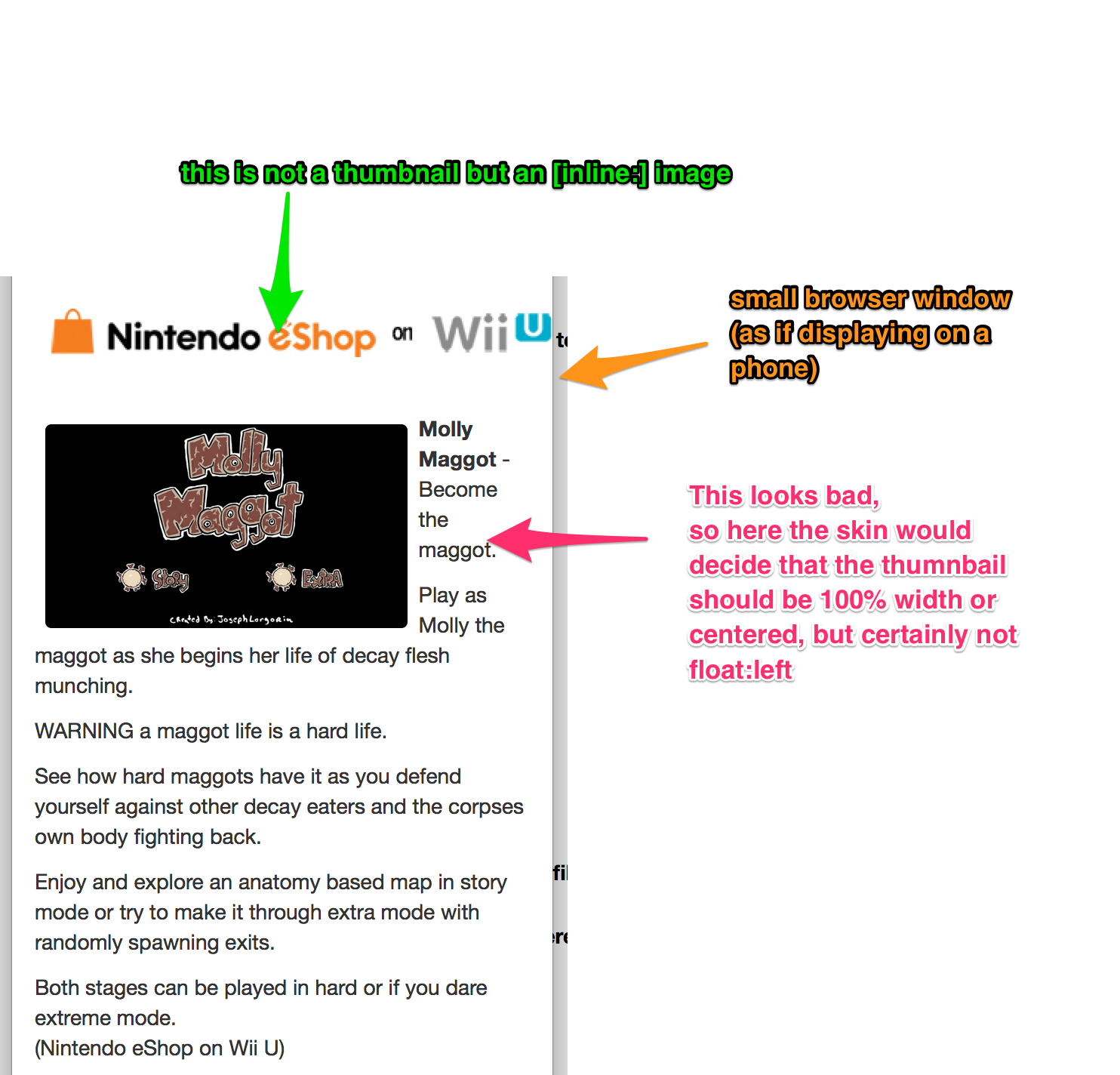
In our case we do at least a weekly post in this style: www.a4at.com/blog/index.php/b/2015/12/31/news-nintendo-download-highlights-new-content-dec-31-2015 or www.a4at.com/blog/index.php/b/2015/12/17/news-nintendo-download-highlights-new-di-2226
In these examples we use some left-aligned images (want thumbnails linking to full size since recent b2evo update) in 180px, 200px, 220px and 240 px widths with fit/auto heights also a standard thumb at 300 px wide auto height.
Just how exactly would the system/skin know where what thumbnail goes? that make almost no sense to me.
Now, for content based images (not the above noted thumbnails similar to: www.a4at.com/blog/index.php/b/2015/12/09/new-content-created-by-mercedes-benz-hit ) we used to just make images 780-800px wide for inclusion between paragraphs, but would like something more auto-sizing (responsive) based on display width, etc.
ok, so for this:
Now, for content based images (not the above noted thumbnails similar to: www.a4at.com/blog/index.php/b/2015/12/09/new-content-created-by-mercedes-benz-hit ) we used to just make images 780-800px wide for inclusion between paragraphs, but would like something more auto-sizing (responsive) based on display width, etc.
It already is responsive if you use the [image:] tag.
But for the thumbnails it's a different story. Do you really want to have do many different sizes of thumbnails that should all open a colorbox/lighbox to show a large version? From what I see on your site, only screenshots would make sense to be zoomable.
Now, how would the system/skin decide?
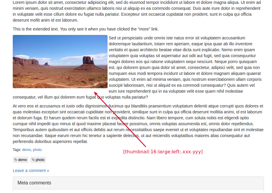
Imagine we make a [thumbnail:...] tag. Then the skin can auto decide on the best size of the thumbnail depending on screen resolution. (And different skins can have different rules of course) See screenshot attached.
Am I making sense?
I'm understanding what you are saying..
If the system/skin can decide it's float / size based on display resolution, that that could work out fine.. as long as on the wider views such as desktops / tablets it continues it's float.
We've been using various image sizes to differentiate between various platforms i.e. 240px for wii-u , 200 for older tv consoles, and so on..
we can use one set (left-aligned) thumbnail at lets say approx 240px (responsive as noted in your example) and another, general use thumb at about 300-320 px (again responsive as needed per your image above)
inline images should, as you stated, already be responsive (and seem to be so, so far)
Yes of course it would continue to float when the width of the windows allows it in a reasonable way.
So can you please show me clear examples of why you need some thumbnails at 240px and some other at 300px ? I still can't get my head around that. It just feels messy to me... (I would have understand it better if you had told me 80px vs 250px for example).
as mentioned, its just mainly for a simple visual representation of the associated console / device that applies- Its not set in stone but I've been doing it for quite a few years now (all manually, of course) and would like to continue if at all possible. I would be ok with one set size in the 240 px range for these left-aligned images.. with most others @ 300-320px (i.e. logos, post title-images, and the like) I've found, over time, that the max workable width is right at 240px hence the repetition.
in my usage, the left-aligned images are "title-screens" and represent the title of the game listed.. they are visual fluff to draw the eye to the entry.
they should be different than any story-attached / related images as they serve a specific function.
Ideally, should the "title-screens" open a colorbox/lightbox or not?
Ideally, should the "title-screens" open a colorbox/lightbox or not?
IMO, yes they should.
In my general use, I add a "post" (teaser or topic) image 320px max width usually floated right, any number of "item" images (could be a game title-page image. a screencap, a product image, etc) that I would usually thumnail to fit in the related text (needs to open in lightbox) and floated either left or right as warranted by context. sizes would vary depending on context 240px for those title-page images and up to 420px for some others with the average, in my case, being 300px.
I also use full screen/size images for product, screencaps. promo-images, and the like centered between paragraphs and at end of article.. if these are resized to fit full-width, then they too need to lightbox to full-size image.
THIS (http://www.a4at.com/blog/index.php/b/2016/01/21/news-nintendo-download-highlights-new-digital-content-for-nintendo-systems-2) is what happens when we don't have a choice of thumbs or the proper floats (IMO).. while some may like it, i think its excessive esp on desktop.
Again allowing for creation and selection of various thumbnail sizes and their placements beyond the current defaults in absolutely required.
I actually like that last example a lot better than floats, but we will implement support for thumbnails.
Just a quick note to mention we're working on this.
Here's a sample of what it's gonna be like:
Looks good so far, will there be options for click for full size / shadowboxed?
They will be click for fullsize by default.
@ppnsteve There is an easier way to add images as html tags. Please see this video: http://bit.ly/1PIa8qs. Just in case, this is the URL of the related manual page: http://b2evolution.net/man/how-to-include-external-photos.
Regards!