2 saunders Feb 04, 2018 22:30


I added an image tag. The html looks like this:
<h2>Blick.Punkt</h2>
<p>[thumbnail:202:large]</p>
<p>[thumbnail:204:large]</p>
<p>[thumbnail:205:large]</p>
<p>[thumbnail:206:small]</p>
<p>[image:205]</p>
<p> </p>
<p> </p>
<p> </p>
<hr />
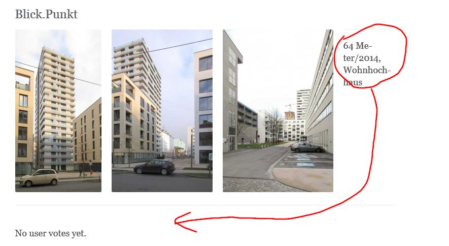
<p>64 Meter/2014, Wohnhochhaus hkjh kjh kjh kjhkjhkjh kjhkhj kjh klhjklhj</p>
This is a screenshot of the outcome:


This does work, but I hope there is a better way to do it, e.g. by tags
<div style="clear: both;"> </div

@saunders can you please send a link to see the misplaced images? Several thumbnails together are supposed to fit well in bootstrap-based skins.
Also for bootstrap skins, using
<div class="clearfix"></div>

@mgsolipa I fixed as mentioned above. So there is no live-link to the problem. Adding thumbnails, one after another or one in a line works pretty. But adding an image without clearfix before shows the effect seen in fig. above (#3)
Thanks for the alternative clear statement and your prompt reply and support.
Nevertheless; 95 percent of bloggers I know are not really familiar with php, css oder html tagging. To work with source code is not comfortable for them. In case to get b2e spread, UI is a challenge.