

2 fplanque Jan 19, 2019 00:42


I played around with b2evo about a year ago and gave up due to navigation confusion. I kept getting lost. Just now playing around with it again and found the source of my confusion. It was the cascading menu changes which might not be the best way to describe it.
Cascading/stacked and hierarchical and I didn't realize that one affects the other from the top down I guess. Finding your way around a new admin area aka back office is always the first thing that people have to do when trying a new script. It really is a good navigation scheme. I just didn't 'get it' the first time testing the script.
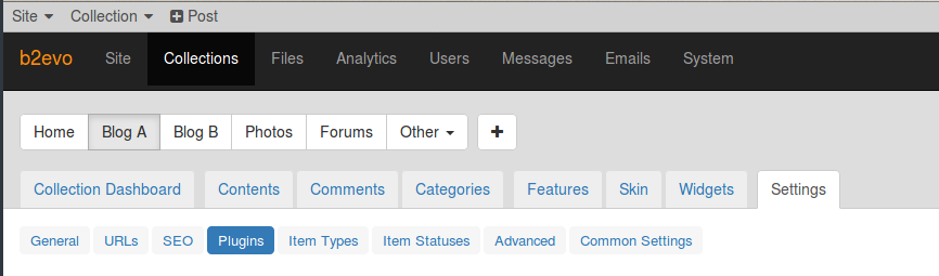
What didn't click with me at the time is that if you're dealing with Collections and you're at Blog A >> Settings >> Plugins and click Blog B, you're still at Settings >> Plugins but for Blog B >> Settings >> Plugins, rather than Blog A.
I think it would be good to have a short video in Important Concepts(https://b2evolution.net/man/important-concepts/) showing the navigation scheme of b2evo Back Office
I think it's fine now that I know how things work. The b2evo way is actually very efficient.
The very first time I tried b2evo, at times, I wasn't sure if I was on the front end or the backend. Part of that might be due to demo content, paired with the fact that both were running a bootstrap theme and as they say, all bootstrap sites kind of look the same. B2evo gives quite a preview of content in the backend and it looks similar to the front end post archive of a blog as the content is sizeable excerpts, complete with images. For the first few minutes of exploring, that was confusing. Mostly it's a matter of lack of familiarity but that's just the way it is with a new system. I didn't much time on it the first go round.
I think most scripts use an extensive left sidebar but that's a lot of scrolling and some are dynamic so when you click on something, most of the menu changes and there's a moment of panic. I often found myself expecting or wishing the wp-admin menu was in alphabetic order. There's no rhyme or reason as to where a plugin dev will put their menu items.
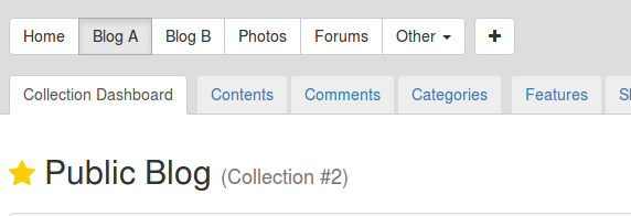
Looking at it now, I do see one thing. In collections, clicking Forums shows an h1 "Forums" at the top of the main container and photos is "Photos" but Blog A says "Public Blog" and Blog B, "Members Only Blog" and in a smaller font, (Collection #2) and (Collection #3), respectively.
of course the menu item(one has just clicked on) being highlighted is kind of a giveaway. All this stuff is just the first minutes of exploring.


@fplanque
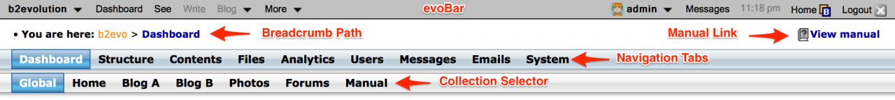
Looking at the last image in the previous post. Blog A highlight is out of step with the next level,
Maybe the top layer in the image should have the blogs that are not being accessed greyed out and the one in use white. otherwise use a coloured tab for the active ones in a consistent manner.
@amoun these are standard bootstrap colors. I am a bit worried about changing them. Is it really not clear for you, which one is the active radio button?
@fplanque
It is clear but not obvious in the sense that other active tabs are lighter not darker. There was/is an a similar issue with the plugin enable/disable switch (can't find the post on that)
It was just food for thought, not a request ?)
So I read most of the docs last night(something I should have done first I suppose) and see where the different menus are explained but in different sections of the guided tour. https://b2evolution.net/man/guided-tour/
I think the beginning of the Back Office tour would be a good spot to put something that shows all menus together and how they react with each other. Could be screenshots and text. I know videos are time consuming to make.
Seems like the Back Office tour needs updating. I haven't seen any breadcrumbs and the menu items have changed.
Thanks for pointing this out. We're in the process of updating the manual pages. We are currently working on the backoffice sections but we'll make a quick detour to update the guided tour asap.
Thanks a lot for your feedback on this.
Besides the documentation / video, is there any other way to present the navigation menus to make this more intuitive?
Should a click on a Collection (like "Blog B") always go back to the "Collection Dashboard" to make it clear that we did in fact navigate somewhere? (at least do this by default and allow a switch for advanced users?)