1 deafsilencer Jul 23, 2015 06:47
3 mgsolipa Jul 23, 2015 07:26

@deafsilencer: well, it's not a matter of what skin works correctly or not. They work on different ways because they are meant for different purposes. Manual collections and skins are meant to display structured contents, so if you click on a category, you will see its content on the right side (subcategories and posts). However, Asevo skin is not prepared to behave that way, so when you click on a category, you will see only the posts that belong to it. That's the expected behavior.
This right here ("My League Useless" second image) kinda scrambled across and unclickable ... it's pointless and useless.
Not true. The list of categories helps readers to know where are located the displayed posts, even in the top level category that he clicked on, or in any of its sub-categories.
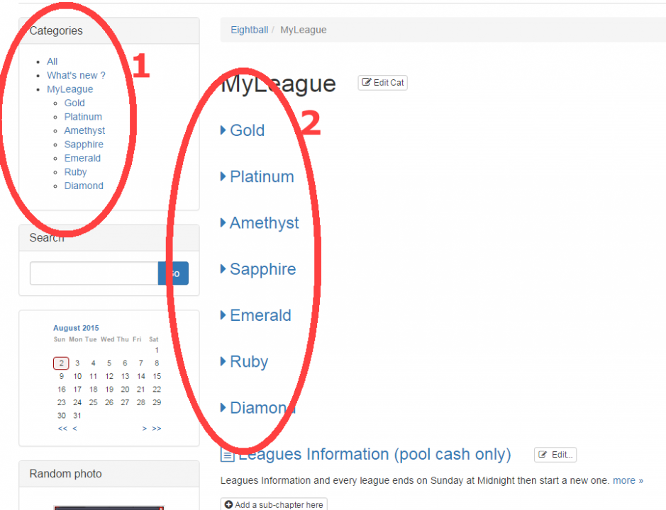
In that bootstrap manual skin ... those league links are neat and clickable is what I would like to have in Asevo skin :)
Maybe it's easier for you to use a Manual collection (depending on what kind of content will you publish) and modify the bootstrap skin to looks like Asevo (colors and details), than try to change the default behavior of the skin. Maybe you should try the codeblock below in your Asevo skin (index.main.php - line 120):
<?php
	if( !empty( $cat ) && ( $cat > 0 ) )
	{
		$ChapterCache = & get_ChapterCache();
		// Load blog's categories
		$ChapterCache->reveal_children( $Blog->ID );
		$curr_Chapter = & $ChapterCache->get_by_ID( $cat, false );

		$callbacks = array(
			'line'  => 'cat_inskin_display',
			'posts' => 'item_inskin_display'
		);

		// Display subcategories and posts
		echo '<ul class="chapters_list posts_list">';

		$ChapterCache->iterate_through_category_children( $curr_Chapter, $callbacks, false, array( 'sorted' => true ) );

		echo '</ul>';
	}
	?>
Finally, duplicate files _cat_list.inc.php and _item_list.inc.php from bootstrap_manual_skin into your Asevo folder. All this is a bit rough and untested, but can help you to get an idea of how it will look like.
Regards!
4 deafsilencer Jul 23, 2015 19:25
it works great ... and one last step is to remove those extra "sub-cat" names
so that sub-cat names will be inside the asevo skin's index.main.php, right ?
Is this right place to edit to remove those skyblue colored rectangle sub-categories ?
<codeblock><?php
// ------------------------- TITLE FOR THE CURRENT REQUEST -------------------------
request_title( array(
'title_before'=> '<h2 class="evo_req_title">',
'title_after' => '</h2>',
'title_none' => '',
'glue' => ' - ',
'title_single_disp' => false,
'format' => 'htmlbody',
'user_text' => '',
) );
// ------------------------------ END OF REQUEST TITLE -----------------------------
?></codeblock>
how did you get that "coding" quote works ?
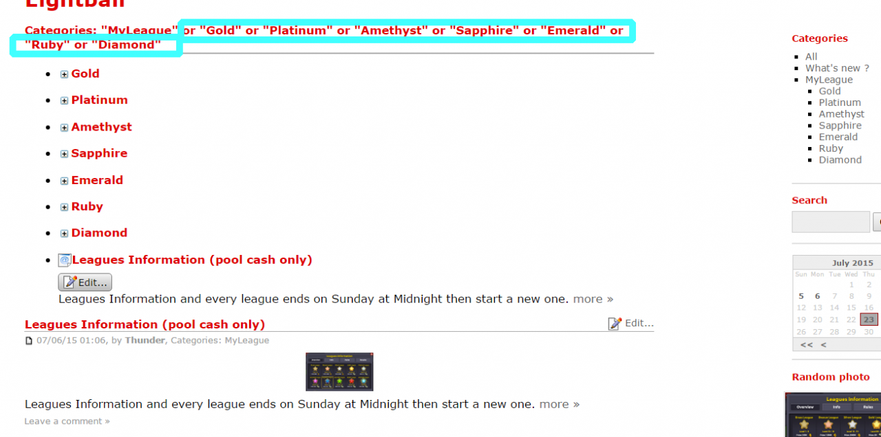
5 deafsilencer Jul 30, 2015 23:45
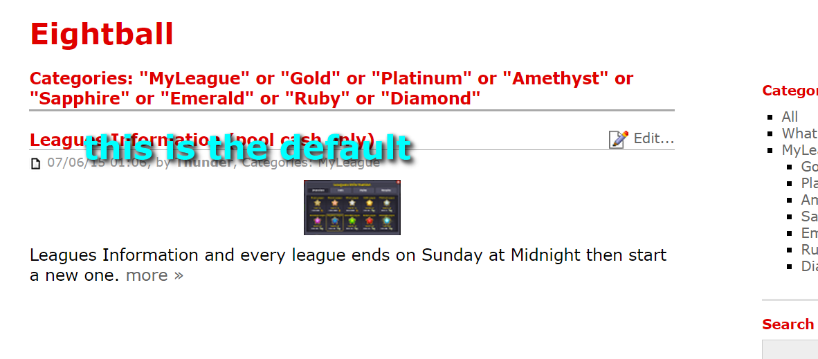
^^^^^ ^^^^^ ^^^^^ ^^^^^ ^^^^^ Default (Before) ^^^^^ ^^^^^ ^^^^^ ^^^^^ ^^^^^
After updated to 6.1.1. (asevo skin)
I will have to do that again but changed my mind into this
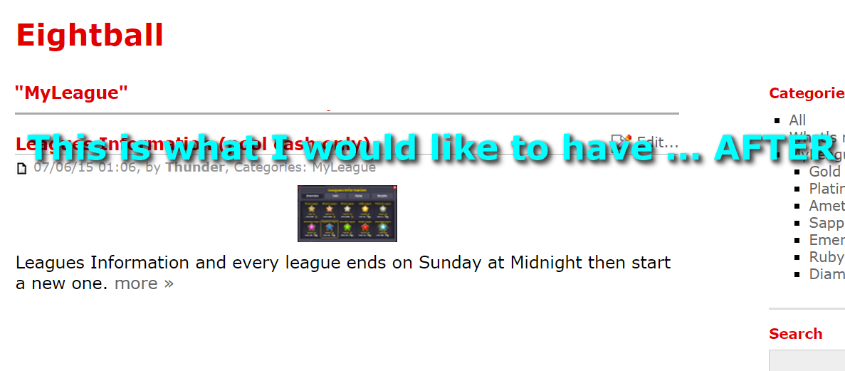
is there a way to remove "categories" and the rest ... except "MyLeague" on that page ?
____________________________________________________________
and AFTER
6 deafsilencer Aug 01, 2015 05:43
Q0003a B2E v6.6.1 Asevo skin
see images above ... before this post
After I clicked on My League on the right side block once ... it loaded ... then ...
all those extra categories on 'main' category page are driving me crazy ...
My League is the Category which is perfectly fine.
BUT ... "do" NOT "show" or "the" or "rest" or "of" or "those" or "sub" or "-" or "categories"
was that annyoing to read ^^^^^^^ ... ?
... Do you mind teaching me how to remove those extra sub category on the 'main' category ?
I tried to remove one by one and ... I still can not figure this code out ... how or where did it fetch those extra sub-categories shows up on the 'main' category (My League)
we have Category/SubCategories on the side menu block is nice !
Sub-Categories is perfectly fine
I already got a headache now :/
7 deafsilencer Aug 01, 2015 05:44
I can not even place the image between sentences ...
*sigh* ... I tried.
8 fplanque Aug 02, 2015 02:24

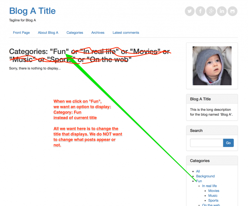
Technically the title is correct because it displays the posts that are in any of all these categories.
Now, I guess you still want that, you just want a shorter version of the title.
Correct?
We will try to make it an option somehow to have a "short version of the title"
9 deafsilencer Aug 02, 2015 07:34
Forgive me for so many jargon language ... for example : Menu Block, Categories Block, Side Block, Side Menu Block etc
So many of them and hard to tell which is which is for ...
I can understand some ... for example : Collectives in the back office ... I was thinking of it as collector like flea market (unlikely like the old style 5.2.2) ... ohh ... (Multi) Sites or (Multi) Blogs, gotcha ... I learned ...
By the way ... back-office (6.6.1) is AWESOME and I like the layout alot (laughing) it's just too many jargons :) I am still learning and still figuring out which is which is for.
Yes, please ... I do not meant "shorter" ... but in a way, yes ... I would like to have it as in "single category" to display
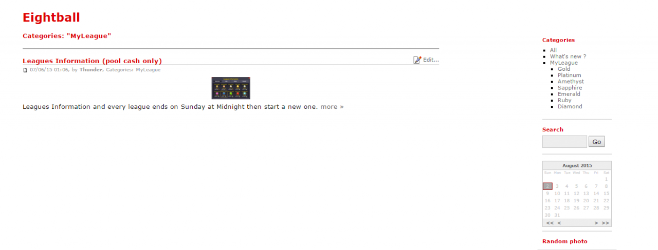
This here (below) after click on "MyLeague" on the side block ... then the main shows too many sub-categories at once
Categories: "MyLeague" or "Gold" or "Platinum" or "Amethyst" or "Sapphire" or "Emerald" or "Ruby" or "Diamond"
^^^ ... that is like sing-a-along song or it is asking me a question to choose but it just ... it's not even a link to click on in the first place ...
anyway (I am sure you get the idea if not then ask please)
(see image attachment: DoubleCategories.png)
If we have on the "Categories" on the side block/menu ... then I just don't understand why have another one or two of them ... one is clickable and other is not clickable ...
Basically All I want was to see what is "MyLeague" all about ... so I clicked that one ...
then I go ... I get confused ... what is all that excessive sub-categories in the "topic" ?
Categories: "MyLeague" or "Gold" or "Platinum" or "Amethyst" or "Sapphire" or "Emerald" or "Ruby" or "Diamond"
Ok, then ... I tried to click on "Platinum" on the TITLE and not the side block/menu ... nothing happens ... oh ... that is not a link ... then that makes me think, "that is pointless to have that there in the topic if I can not click on it" also it needs to be more neater, easier to read and clickable.
The Sub-Categories are wonderful ... simple and clean
At last,
if I clicked on "MyLeague" on the side block and I only would like to see ... just ... this
Categories: "MyLeague" (on the "MyLeague" page) while the clickable sub-categories at the bottom footer after "MyLeague" posts
So simple, yet elegant ...
Ahh ... now ... I am on THAT "MyLeague" page and not in SUB-categories to be clear in understanding where am I at now ...
It just like the bootstrap manual skin but not necessary because it already have a Categories block at the side of a page there.
Which one is easier to read and follow ?
(A) Categories: "MyLeague" or "Gold" or "Platinum" or "Amethyst" or "Sapphire" or "Emerald" or "Ruby" or "Diamond"
or this
(B) Categories: MyLeague
For Sub-Categories
if I want to go deeper into sub-categories then ... it should acts like this one (see C)
(C) Categories: MyLeague > Platinum
I hope that makes sense and I apologized for my frustration because I still can not find that code to solve it
... I do not know how all of you create this Multi-Blog design ... B2E is amazing and you all are AMAZING, too :)
p.s. Also I wonder ... since "topic" is text format ... Am I able to upload a "topic" image format to replace "topic" in text format ?
10 fplanque Aug 02, 2015 17:43

@deafsilencer We really want to help you but you make it really hard. Your posts are VERY hard to read because they are long, not well formatted (No clearly defined sentences, way to many uses of "...", no effort in formatting, no proper use of paragraphs), are not really perfect English and it seems they complain about multiple problems at the same time.
At the same time, we work on 50 bugs per day. We don't have infinite time to try to decode complicated posts. We have to give priority to the clearly expressed problems.
So please help us help you:
- Make ONE forum topic for EACH different problem.
- Post a single screenshot of what you see that does not seem right to you (ONE problem at a time)
- Write what you would like to see instead (or draw it and post the drawing)
- If you cannot refrain from adding frustration and venting, please clearly separate it from the problem description and the request, so we know what to focus on. (Do you want us to focus on a solution or do you want us to focus on your frustration).
- If you have a second problem, make a DIFFERENT forum topic for it.
Again, you made it clear you are not happy with some things but you make it too hard for us to clearly and unambiguously understand A-the problem B-what you want.
Please make the problem clear without blurring the message with different problems and a lot of text that is not descriptive.
11 deafsilencer Aug 02, 2015 18:36
this here ... means brief of "not talking" (like between sentence)
I am sorry that I am deaf and my english grammer *is* SUCKS, but that's ok ... none taken :)
I will post a new one with "one problem" at a time
Thank you.
12 deafsilencer Aug 02, 2015 19:12
13 deafsilencer Aug 02, 2015 19:25
since I can not create a new topic ... so, here :
(BRAND NEW START : NEW TOPIC)
See the screenshot. That is what I would like to have
or this demonstration video
https://www.youtube.com/watch?v=e2CzUrLQyQo
14 fplanque Aug 02, 2015 20:26

Of course you can create new topics. Just click on "save for community". (I agree it's not ideal the button is grey but it works)
Also, despite your username, I did not realize you were deaf. I am not sufficiently aware of what this implies to realize if and how it impacts the way you read and write.
Please understand however that the way you write without clearly defined sentences and with no respect for paragraphs makes it extremely hard for me to read you. For example:
@deafsilencer wrote earlier:
See the screenshot. That is what I would like to have
or this demonstration video
Why is this spanned on 3 different paragraphs? It should be a single paragraph.
When you write 30 lines like this with a few words per paragraph (not even a complete sentence) as in "or this demonstration video", your message has no structure and requires more than ordinary effort to decipher (at least for me).
PS: we'll work on this:
15 deafsilencer Aug 02, 2015 23:35
Thank you.
16 fplanque Aug 03, 2015 01:48

I have made an implementation for this in this branch:
https://github.com/b2evolution/b2evolution/commits/feature/request-title
If you know your way around github you can check it out but I would not call this production ready.
It will be cleaned up and probably release in version 6.7.0.
17 deafsilencer Aug 03, 2015 03:20
Ok, I really appreciated your effort.
18 deafsilencer Aug 05, 2015 20:47
I have made an implementation for this in this branch:
https://github.com/b2evolution/b2evolution/commits/feature/request-titleIf you know your way around github you can check it out but I would not call this production ready.
It will be cleaned up and probably release in version 6.7.0.
I just tried it and double check github codes twice ... nothing has changed yet, so I want to know if this has to do with specific skin to choose to make it work ?


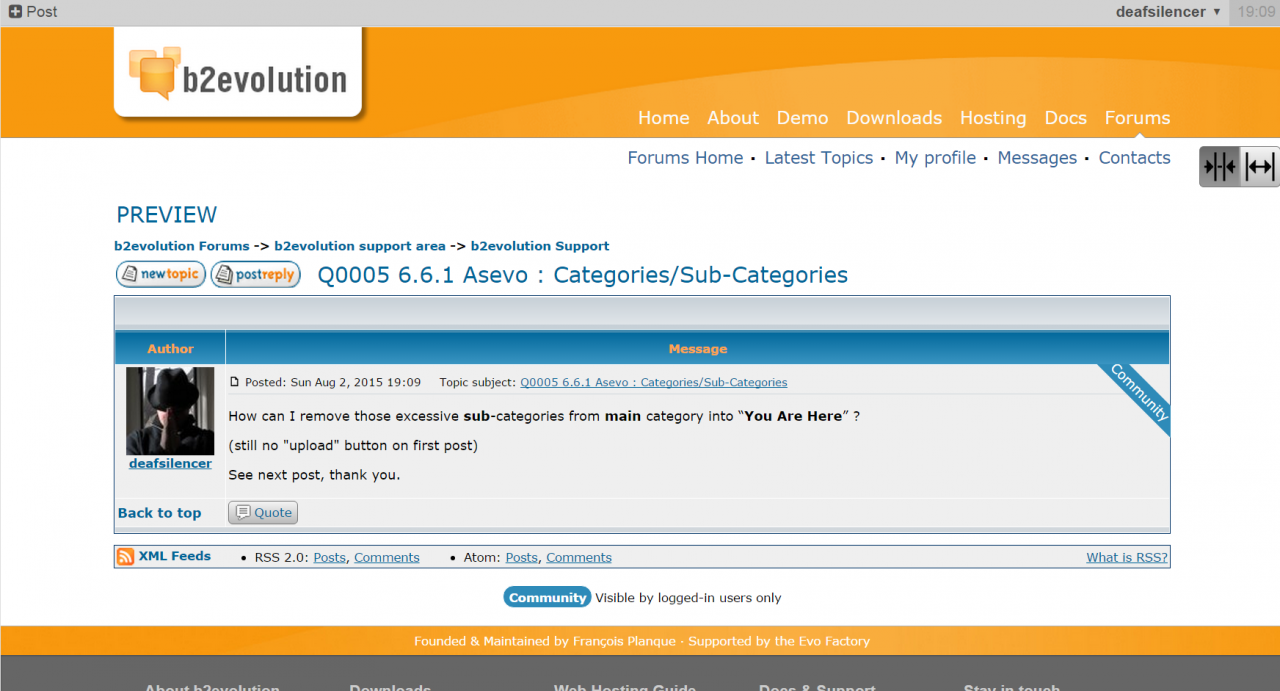
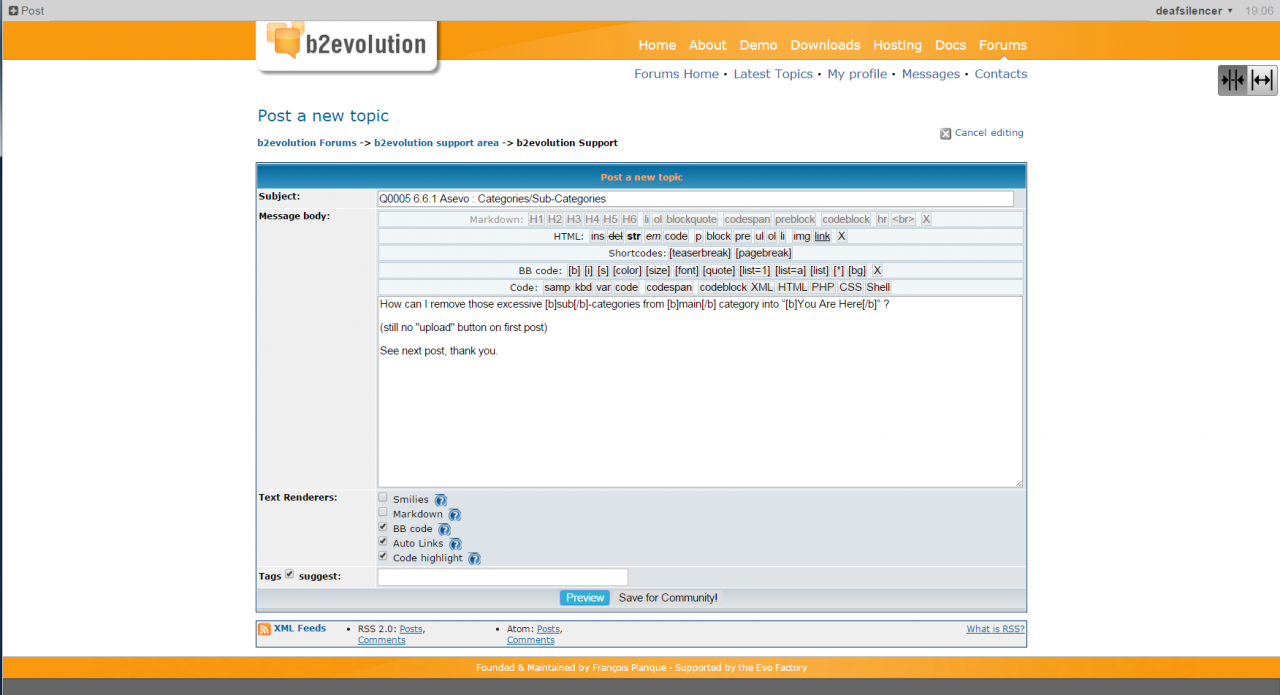
Sorry that I couldn't rearrange the images with texts after uploaded
See "parenthesis" for image name
After I click on this "MyLeague" link (see "Orange Hand Mouse" first image)
This right here ("My League Useless" second image) kinda scrambled across and unclickable ... it's pointless and useless.
I wonder if that is messed up in Asevo's coding ?
At last ...
... Why can't Asevo ends up like this one ("My League Should" third image) ?
(bootstrap manual skin ... the only skin that works right)
In that bootstrap manual skin ... those league links are neat and clickable is what I would like to have in Asevo skin :)