

 General Support
2 fplanque Mar 12, 2019 23:28

 b2evolution CMS Support Forums
Today I've noticed problem with a widget it is viewed differently if the browser is in a small window or full screen
this is the windowed positron and dinension of the widget, the 2 post with teaser image is positioned after front featured post
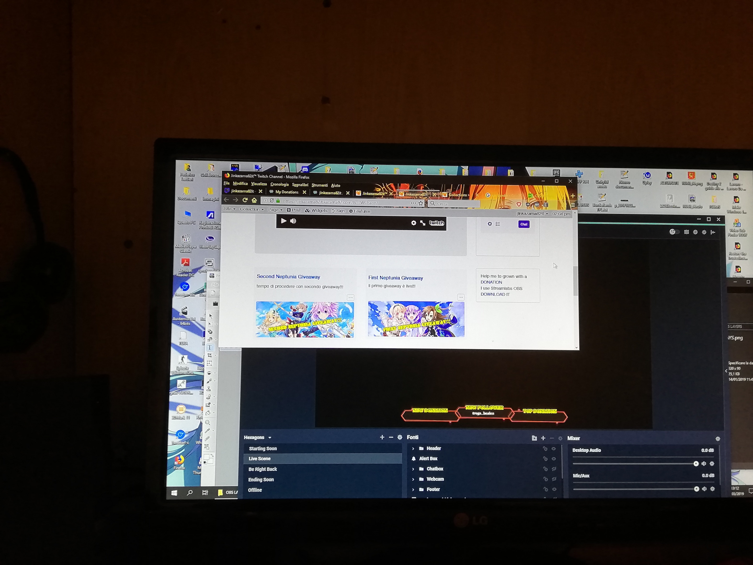
here the same widget but in full screen

the front featured post don't change its width or heigth, but the widget in question when the browser is in window mode are more bigger than in full screen... we have a problem!! how I can fix this widget issue?

Hi I'm glad @fplanque gave his opinion as I had looked at the issue earlier and didn't know what to say. I wasn't too sure of the problem and wondered if there was one. I couldn't really tell from the screen shots what you meant.
You mention the universal item widget but again I'm not sure how you are using it.
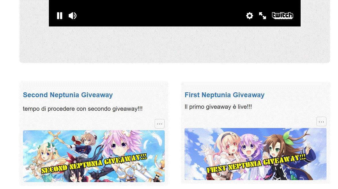
The only issue I see is the 2nd Neptune Giveaway shown in the image below that seems too wide when on a narrow screen.
It seems the table you have in the post is too wide for the container and is not responsive to width adjustments when changing screen width. So it looks like you will have to make some changes to the content or use css to manage it.
Query the style in the table. Surely [margin:0 auto] is all that you would need, you don't need a left and a right. Plus if this is hand coded be better to add a class or ID and put the parameters in a css file.

the table after the widget isn't the final version, but if i hide it with a comment block the behavior of the widget don't change it appear more big in a small window an small in a full screen is it totally nonsense for me, even because the widget don't offer a way for personalize it and fulfill the main column like in windowed version.
Is this the problem
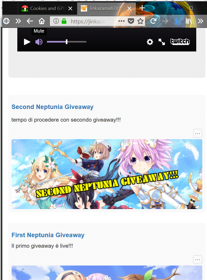
Image one with narrow screen shows the 'giveaways' bigger
With an even narrower screen the 'giveaways' are vertical
If this is the problem then it's due to the width being that of the container. If you have two 'widgets'/objects side by side then as the container shrinks stuff is moved to the next line. Unlike text which has a font-size the contents of the widget fit the widget and the widget fits the container. If the widget had a fixed width say 50% of the container then you could have two horizontally.
It looks like the widgets have a minimum size, so by shrinking the container one has to drop.
As @fplanque said you will have to fiddle with the css to make changes.
edit css isn't easy, is vast and can potentially broken other thing in other widget, by the way when I have time I search a way to fix the css or add extra parameter for an inline style parameter to the widget
You can add a class to the widget content, either inline code to the text or
a) alter the css selector parameters for stuff in image 1 or what I would try is
b) add a class somewhere like [/media/blogs/the_collection_name/style.css] and link to it via image 2
So will leave you to sort it. Have fun :)
I Tried to play with the rwd parameter before to edit the code and I found the way for render the widget with the right dimension.
@jinkazama82it I Tried to play with the rwd parameter before to edit the code and I found the way for render the widget with the right dimension.
Would be nice for to post the solution so others can benefit if they read this post for a similar reason
when you set a widget with the RWD option appear a line similar to this col-sm-6 col-md-6 col-xl-4 col-xs-12, the number indicate the width of object 6 is 50% of the main column 12 is the 100% of the main column and obviously the 4 is 1/3 of the main column and when it is 4 the blog render the widget for put 3 element in a row, so practically the col-xl-4 is the problem I modified it in col-xl-6 and solved the issue of different aspect when the page is in full screen even in col-xs-12 continue to be 12 because 2 element in row in a small window isn't very good.
Think I understand :)
Thanks
tutta la a little of topic but... by the way, is there a way to order the item rendeted like with the order used in blog?
atv the moment in order parameter i found only specific ordering like priority or date issued, etc., etc., but if I would like to view in the exact order of the main blog, for example in my news feed actually I set to view for first the post with the highest priority and the second is the post with lower priority but at the same time the latest published and older, i can't.
If I understand you correctly, what you really need is multiple levels of sort orders in the Universal Item Widget?
we will add additional settings to the UIL widget shortly.
This post has 1 feedback awaiting moderation...
I don't see a problem. This is standard Bootstrap RWD behavior. Change the CSS classes if you don't like it.